My advert, digipak and music video are all part of the same package. The idea behind the project was to create something coherent, with a 'house style' that attracts my specific target audience. The digipak and advert were designed to attract consumers to the main product and be a push to persuade the audience to buy it. This question is asking how much all three products linked together to create a professional looking package.
Here is my Digipak. It has been made with the same colour scheme, using photos from one specific shoot. The colours are to reflect the genre but in a more vibrant way than other artists in the genre have used. The country, indie genre, referring to research, uses very desaturated colours. Most of the music in the genre is very outdoors based and so concentrates on outdoors colours. They stick to blues, greens and browns. Some videos in the genre also use sepia tones to roughen up the look of the song, creating something to look more upmarket, not using cheap bright colours or lights. However, in my video I have decided to go against the genre in a way and saturate the colours, increasing the contrast and dramatizing the front to pull the audience to something different. I have tried to keep the same colours throughout the Digipak.
Here are a few covers to similar artists tracks around the indie/folk/country genre. The colours are desaturated, and stick to a similar scheme, however are not as saturated as the cover I have produced which is against the genre.
The name superman, automatically, made me think, Urban, cities, sky scrapers, a man in a cloak and I wondered how I could link the name into something completely out of its comfort zone. I decided to redesign the official Superman logo into something more country looking.
Here is the original Superman Logo. On my version, I have changed the shape of the badge, however, kept the 's' in the middle. I have included some small blades of grass to give it more of a countryside look and reversing the original. I think that the logo is good and is the same through both the digipak and advert, but there is no reference to it in the video.
The font throughout the package was a font that I thought looked like the type you would find in a comic book or a front cover of one. I thought I would play with the meaning and add the comic book/ urban meaning to the song too so people can have their own interpretation on it. I thought that the continuous use of it looked professional, however I could have used it in the video for an introduction of some credits.
The style of imagery in the video is one thing that is very similar to the front cover of the digipak and advert.
The CD in the digipak has the long grass, bright colours and the sky is red, dramatic light and saturated tones. Here are some images of the digipak and the video next to each other to show some of the similarities.
This video is also used in question three but I have placed it here to refer to how my video, advert and digipak is seen to be coherent across the package. The second half of the video talks more on this.
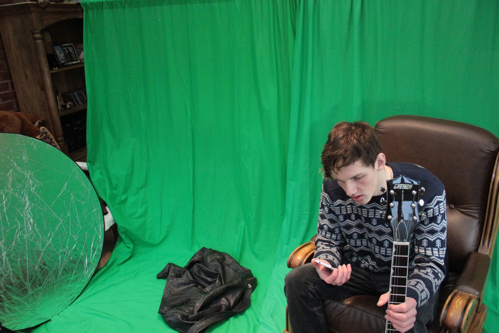
Another shoot today, and the original plans went horribly wrong. I had planned to shoot outside but unfortunately, it decided to snow again. A friend of mine kindly gave us his conservatory to turn into a studio for getting the same natural light. The shoot went really well and I am proud of the results.
This is my music video so far. I have uploaded this to YouTube to get feedback and evaluate what I have done so far.This is a third of the way through.
Today it is snowing again. This is really disrupting my video and the days we have to film are getting fewer. When things go bad you have to improvise and thats exactly what I will hopefully do today. I am hoping to recreate the shots I have taken already but in the snow, with Josh in winter clothes. The clothes and the scenery will look different but the composition of the shots will stay the same. In the video we can hopefully then flick backward and forward between snow and sun!
Corin Hardy's Behold the Hurricane video is the type of video I would like to shoot. It is focused on mostly just one character and his feelings. The Superman song expresses lots of emotion and anger and this song by The Horrible Crows is a good match and inspiration to filming my video.

.jpg)